Product Imagery Pattern
Across IBM Data & AI, product imagery needed to work across very different products and moments, from product introductions and onboarding to feature education and provisioning. I led the visual exploration, working with Product, Brand, the Illustration Guild, and Carbon to define a language where structure, data, color, human presence, and motion could feel connected while still serving a clear purpose inside the product.
Team
Cross functional partners
Timeline
5 months
Role
Role
Visual Design Lead
Visual Design Lead

Understanding the landscape
I started by auditing how imagery was being used across watsonx products. Existing imagery often worked well individually, but became incosnsitent across products, didn’t always communicate the capability clearly, and struggled to scale across different product surfaces. I also looked at the broader watsonx brand, existing illustration systems, and visual treatments already used by other teams to understand where a new language could connect and where it needed to remain distinct.
The audit made it clear that this was not simply an illustration consistency problem. We needed to define:
What the imagery should communicate
How it should relate to the larger brand ecosystem
How much visual presence it should have inside a working product.
Understanding the landscape
I started by auditing how imagery was being used across watsonx products. Existing imagery often worked well individually, but became incosnsitent across products, didn’t always communicate the capability clearly, and struggled to scale across different product surfaces. I also looked at the broader watsonx brand, existing illustration systems, and visual treatments already used by other teams to understand where a new language could connect and where it needed to remain distinct.
The audit made it clear that this was not simply an illustration consistency problem. We needed to define:
What the imagery should communicate
How it should relate to the larger brand ecosystem
How much visual presence it should have inside a working product.

Defining the visual language
We started by asking what each product needed the imagery to communicate before deciding how it should look. Across watsonx, the products represented different kinds of work, from building and working with AI, to governing it, to organizing and managing data. Many of those ideas are abstract and technical, so the challenge was to translate them into a visual language that felt clear, grounded, and trustworthy without becoming overly literal.
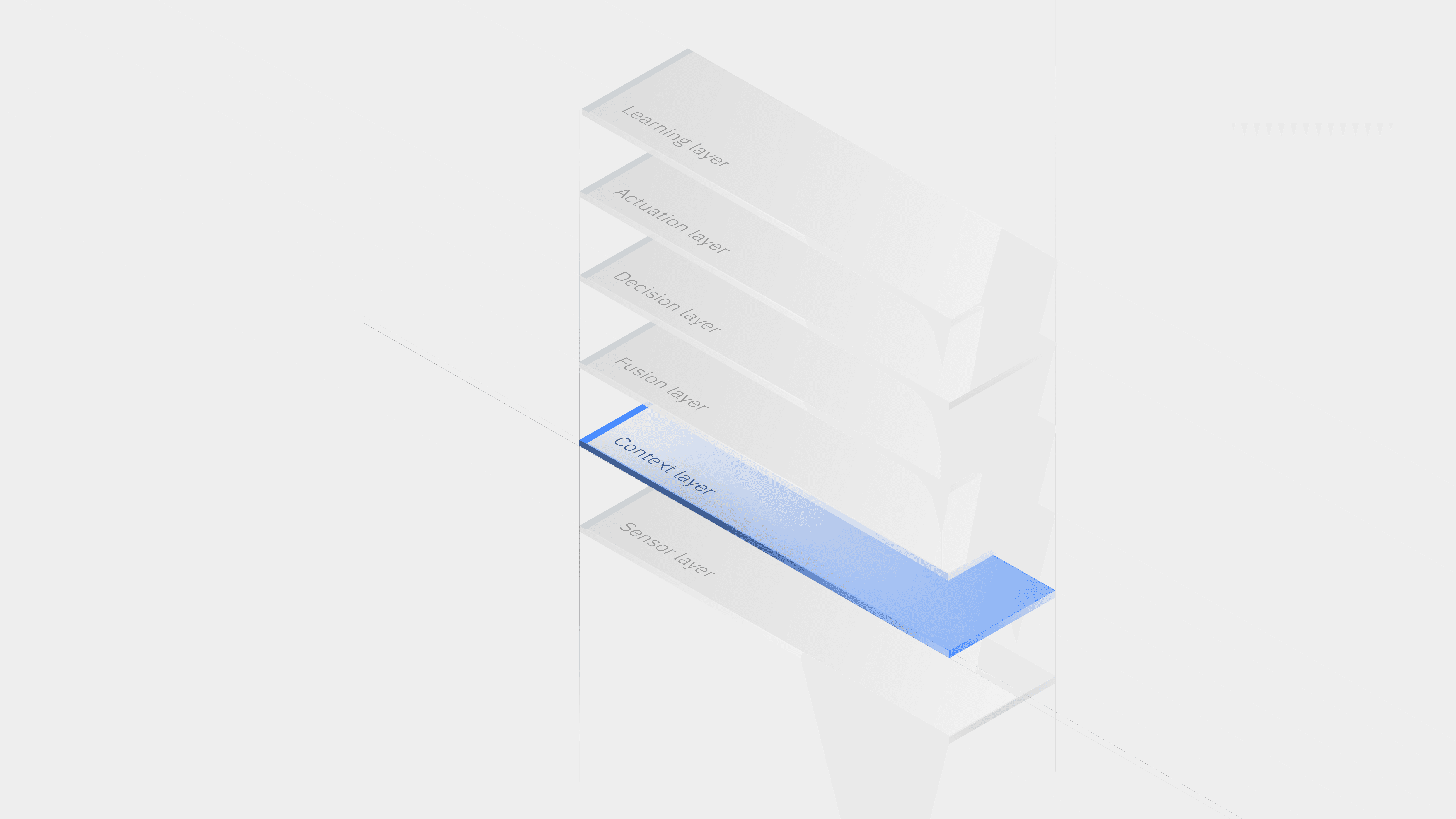
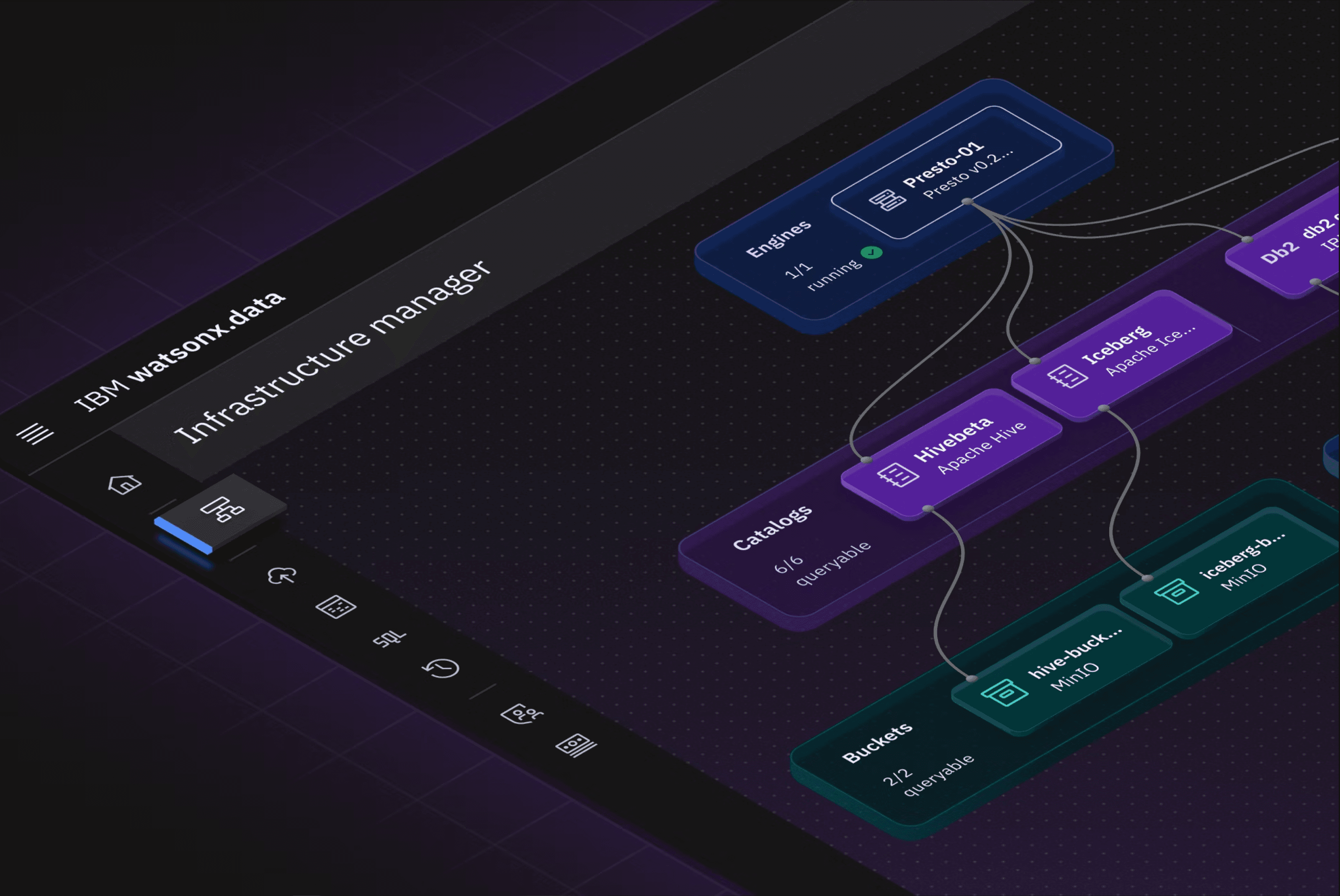
From there, we explored how individual visual elements could carry meaning. Structure and grids helped express systems, organization, and data architecture. Dots represented data points, models, or entities within a larger system, while connecting lines helped communicate relationships, movement, and flow. Gradient and dimensional color brought in the more expressive AI character of watsonx, but we kept that layer lighter inside the product so the imagery could feel intelligent and forward-looking without becoming visually overwhelming.
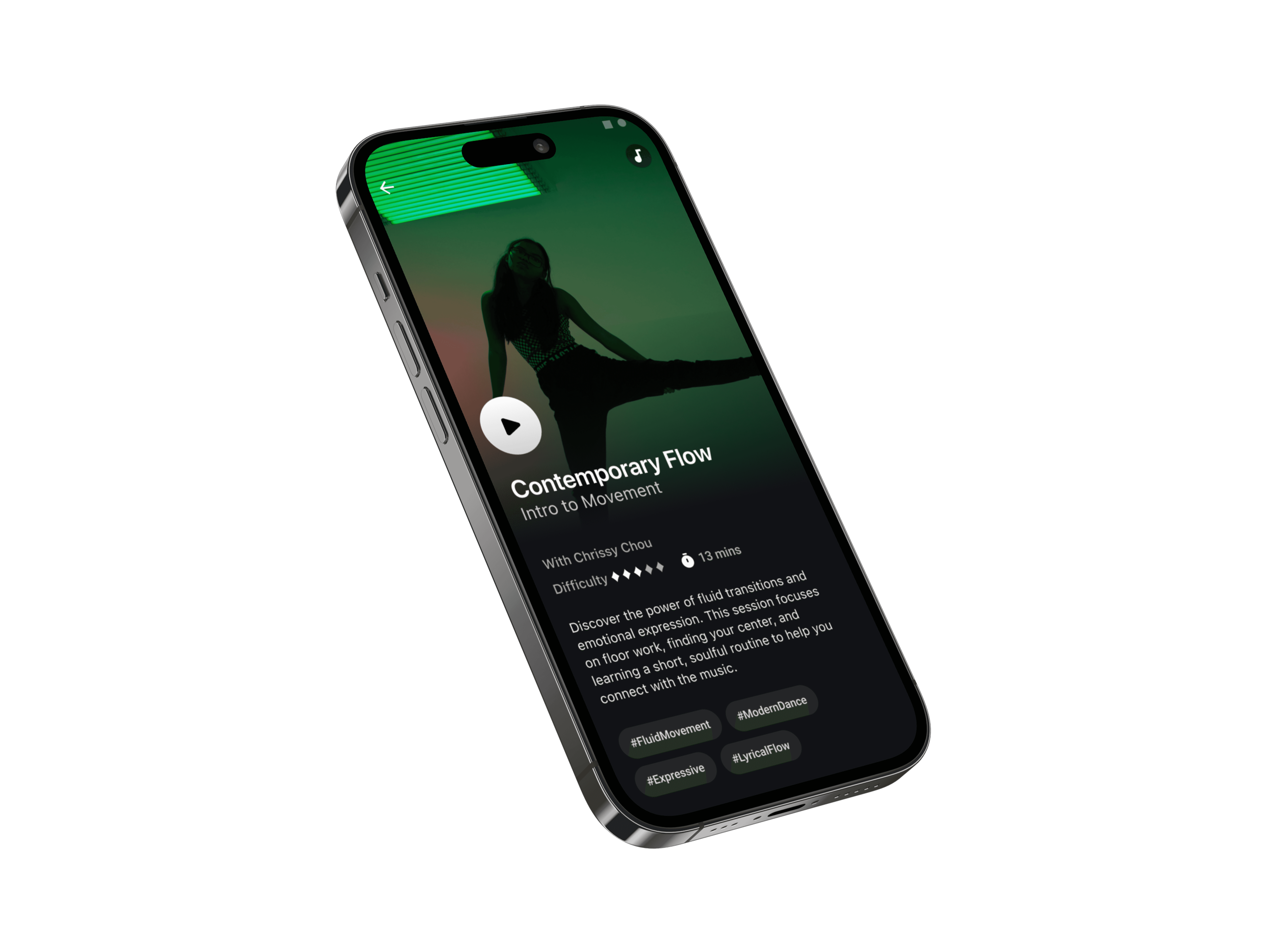
Human references followed the same principle. We used them selectively, only when a person was genuinely part of the product story, such as configuring or tuning a model. This helped human presence communicate real participation rather than simply making AI feel more human.
The goal was to create a language that could make abstract product concepts easier to understand while still giving each product its own character. The system needed to feel intelligent, but not magical; expressive, but not distracting; technical, but still approachable.
Defining the visual language
We started by asking what each product needed the imagery to communicate before deciding how it should look. Across watsonx, the products represented different kinds of work, from building and working with AI, to governing it, to organizing and managing data. Many of those ideas are abstract and technical, so the challenge was to translate them into a visual language that felt clear, grounded, and trustworthy without becoming overly literal.
From there, we explored how individual visual elements could carry meaning. Structure and grids helped express systems, organization, and data architecture. Dots represented data points, models, or entities within a larger system, while connecting lines helped communicate relationships, movement, and flow. Gradient and dimensional color brought in the more expressive AI character of watsonx, but we kept that layer lighter inside the product so the imagery could feel intelligent and forward-looking without becoming visually overwhelming.
Human references followed the same principle. We used them selectively, only when a person was genuinely part of the product story, such as configuring or tuning a model. This helped human presence communicate real participation rather than simply making AI feel more human.
The goal was to create a language that could make abstract product concepts easier to understand while still giving each product its own character. The system needed to feel intelligent, but not magical; expressive, but not distracting; technical, but still approachable.


Designing for context
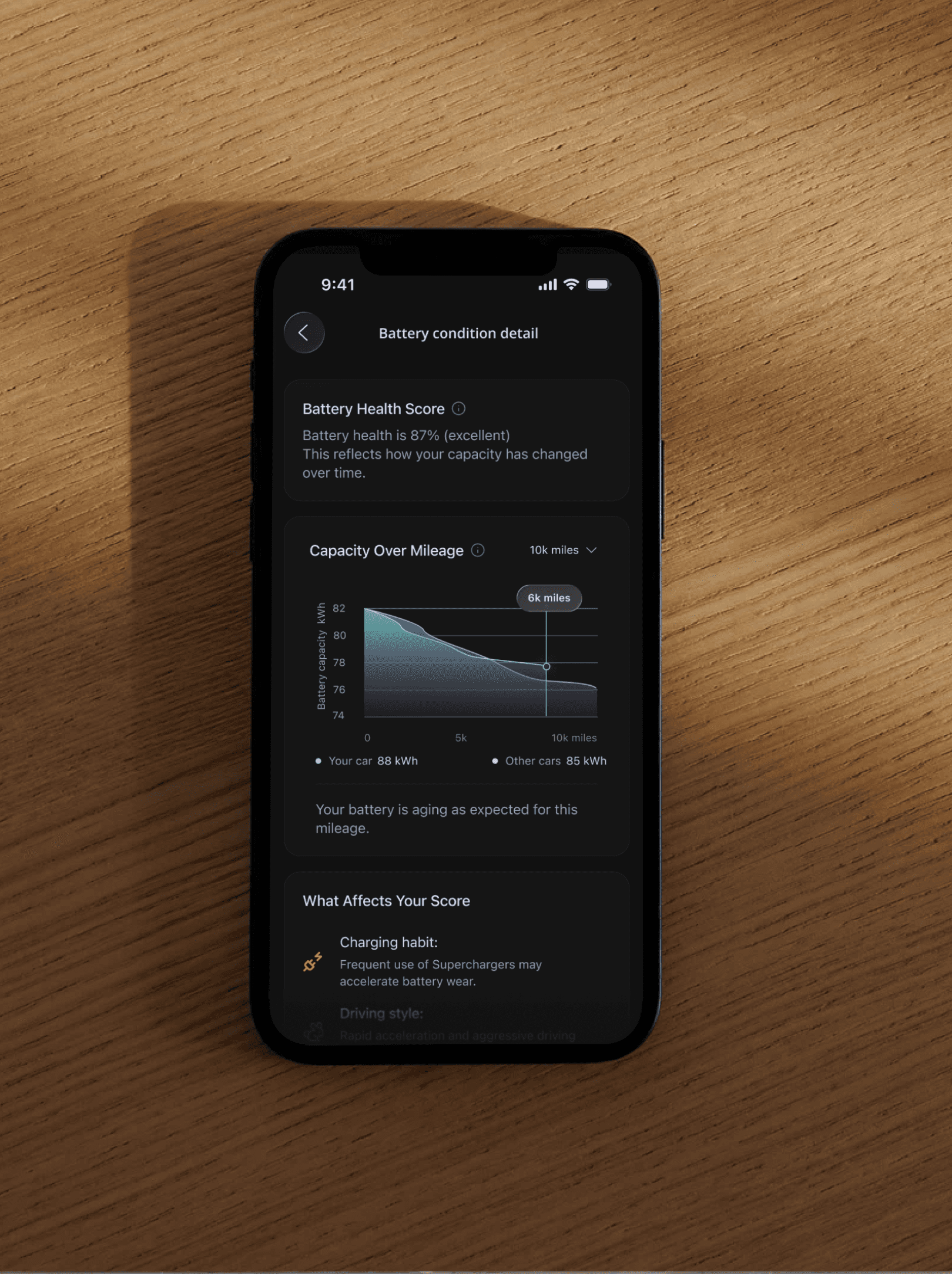
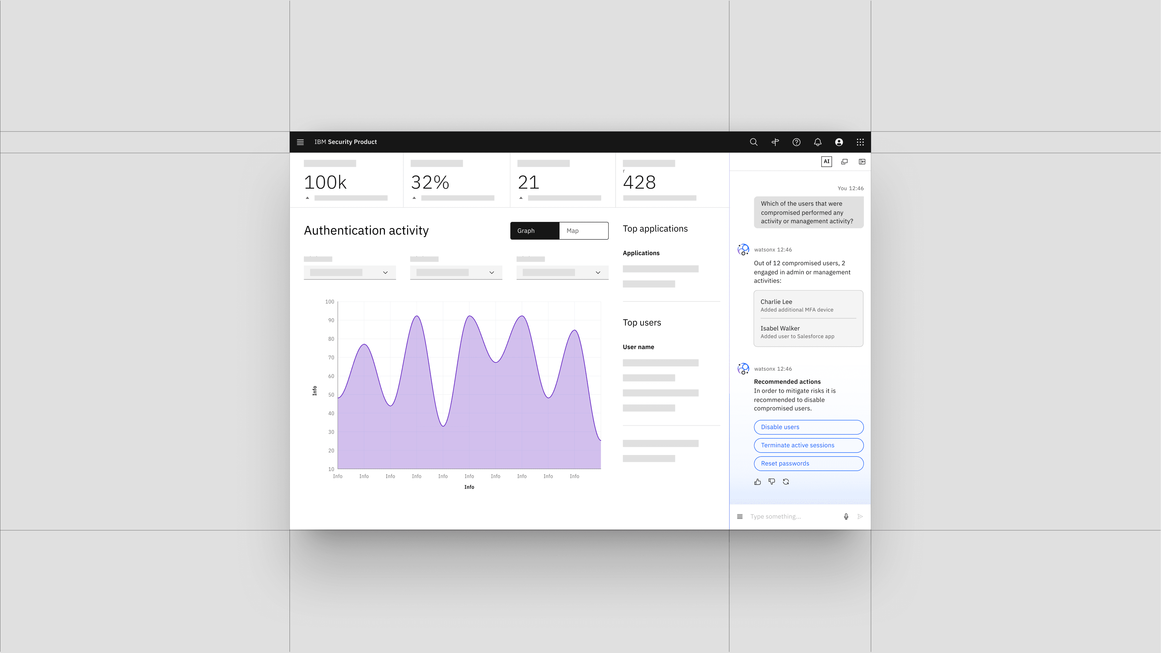
The visual language could not behave the same way everywhere. Large product moments had room for richer composition, stronger color, and subtle motion, while smaller or task-focused surfaces needed fewer elements and lower visual density. A composition that worked well in a wide hero could become overly complex when reduced to a smaller surface, so the system had to adapt its information density rather than simply scale artwork down.
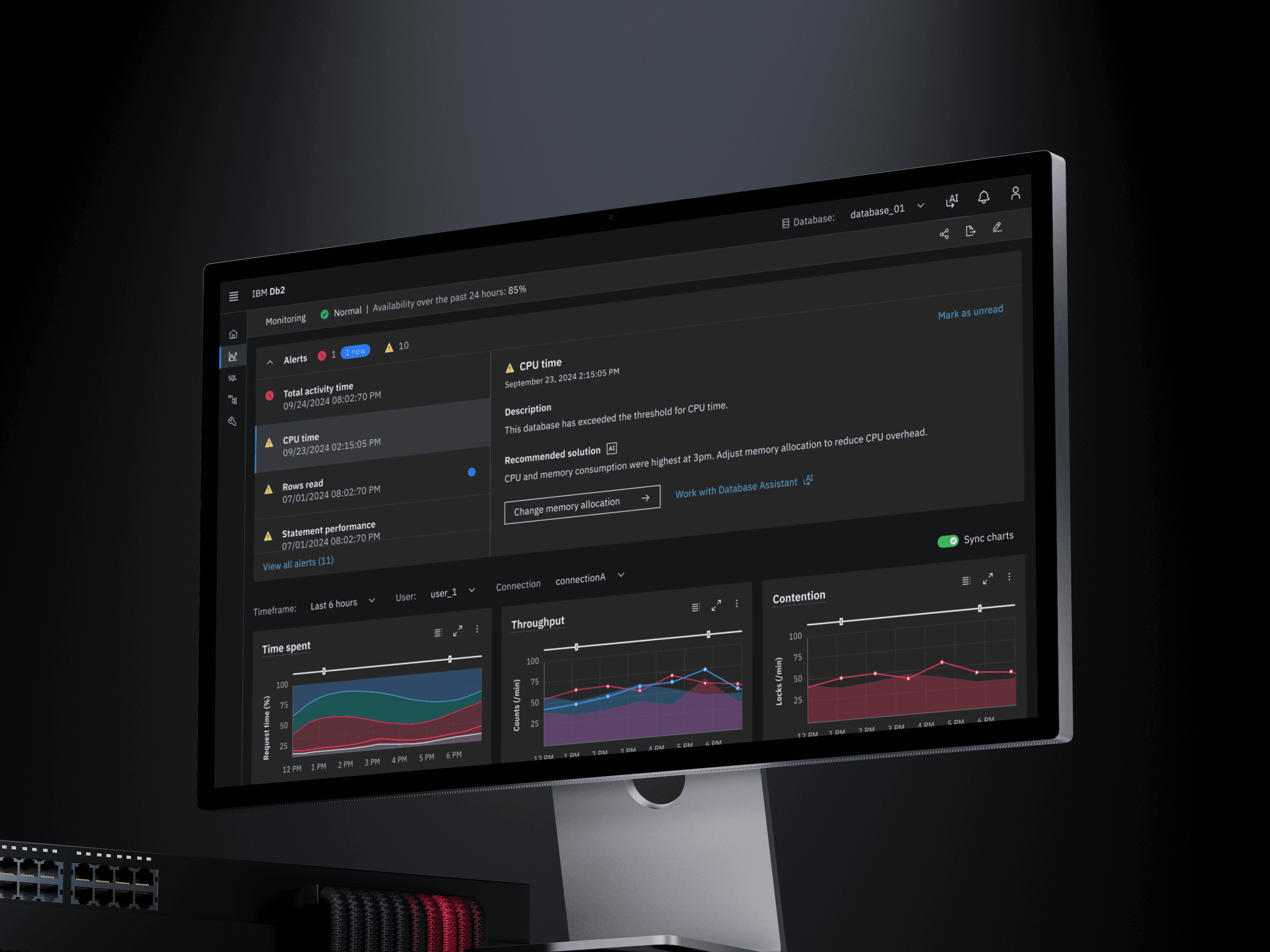
We also adjusted the overall visual volume as imagery moved from marketing into the product. Marketing expression had more room to be immersive and emotionally expressive, while product imagery needed to feel lighter and more integrated with the interface. We kept enough color, dimensionality, and visual character to maintain continuity with watsonx, while reducing saturation, complexity, and movement as users moved closer to action.
Motion followed the same principle. We used subtle movement to reinforce relationships already present in the imagery and to shape the feeling of moments that involved waiting, transition, or progress. A gentle shift in structure, connection, or flow could make the experience feel active and engaging without turning motion into a distraction. As users moved closer to direct action, the motion became quieter so the interface remained primary.
Same language. Different visual volume.
Designing for context
The visual language could not behave the same way everywhere. Large product moments had room for richer composition, stronger color, and subtle motion, while smaller or task-focused surfaces needed fewer elements and lower visual density. A composition that worked well in a wide hero could become overly complex when reduced to a smaller surface, so the system had to adapt its information density rather than simply scale artwork down.
We also adjusted the overall visual volume as imagery moved from marketing into the product. Marketing expression had more room to be immersive and emotionally expressive, while product imagery needed to feel lighter and more integrated with the interface. We kept enough color, dimensionality, and visual character to maintain continuity with watsonx, while reducing saturation, complexity, and movement as users moved closer to action.
Motion followed the same principle. We used subtle movement to reinforce relationships already present in the imagery and to shape the feeling of moments that involved waiting, transition, or progress. A gentle shift in structure, connection, or flow could make the experience feel active and engaging without turning motion into a distraction. As users moved closer to direct action, the motion became quieter so the interface remained primary.
Same language. Different visual volume.


Testing and refining the language product expression
The real test was whether the language could survive outside the original exploration. We applied it across different watsonx products, image sizes, themes, and product moments, and looked for where the system began to lose meaning, become too dense, or resemble visual patterns already used elsewhere.
Those edge cases became the basis for refinement. Through recurring critique with Product, Brand, Marketing, the Illustration Guild, a11y team, and Carbon Design system team, we narrowed the language around what could remain shared and what needed to flex by context. I led the exploration with two visual designers, using each review to sharpen the rules.
Testing and refining the language product expression
The real test was whether the language could survive outside the original exploration. We applied it across different watsonx products, image sizes, themes, and product moments, and looked for where the system began to lose meaning, become too dense, or resemble visual patterns already used elsewhere.
Those edge cases became the basis for refinement. Through recurring critique with Product, Brand, Marketing, the Illustration Guild, a11y team, and Carbon Design system team, we narrowed the language around what could remain shared and what needed to flex by context. I led the exploration with two visual designers, using each review to sharpen the rules.

Turning visual decisions into a system
The final guidance documented the visual grammar, composition principles, contextual usage, color behavior, light and dark themes, responsive considerations, and reusable assets. By this point, elements such as grids, dots, lines, gradient, human references, and motion were no longer isolated styling choices. Each had a role within the system and a clearer set of conditions for when it belonged.
The framework also gave teams a way to evaluate new imagery rather than starting from a new style each time. New use cases could be tested against the existing principles, and the language could expand when the current grammar no longer expressed the product concept clearly enough.
This made the system flexible without losing the reasoning that held it together.
Turning visual decisions into a system
The final guidance documented the visual grammar, composition principles, contextual usage, color behavior, light and dark themes, responsive considerations, and reusable assets. By this point, elements such as grids, dots, lines, gradient, human references, and motion were no longer isolated styling choices. Each had a role within the system and a clearer set of conditions for when it belonged.
The framework also gave teams a way to evaluate new imagery rather than starting from a new style each time. New use cases could be tested against the existing principles, and the language could expand when the current grammar no longer expressed the product concept clearly enough.
This made the system flexible without losing the reasoning that held it together.

Outcome
The framework gave teams a shared starting point for product imagery instead of reinventing a visual direction for every new use case. We created reusable Figma and illustration templates, defined color tokens, and published the guidance on IBM’s product site with downloadable assets so teams could apply the system consistently.
The language was adopted across 8 product teams within the Data & AI organization and shipped across multiple product experiences. Because we worked closely with Marketing throughout the process, parts of the visual language were also extended into broader brand and campaign work, creating a stronger connection between the product experience and how watsonx was represented externally.
8 product teams adopted
Reusable Figma + illustration templates
Published guidance + downloadable assets
Outcome
The framework gave teams a shared starting point for product imagery instead of reinventing a visual direction for every new use case. We created reusable Figma and illustration templates, defined color tokens, and published the guidance on IBM’s product site with downloadable assets so teams could apply the system consistently.
The language was adopted across 8 product teams within the Data & AI organization and shipped across multiple product experiences. Because we worked closely with Marketing throughout the process, parts of the visual language were also extended into broader brand and campaign work, creating a stronger connection between the product experience and how watsonx was represented externally.
8 product teams adopted
Reusable Figma + illustration templates
Published guidance + downloadable assets
Outcome
The framework gave teams a shared starting point for product imagery instead of reinventing a visual direction for every new use case. We created reusable Figma and illustration templates, defined color tokens, and published the guidance on IBM’s product site with downloadable assets so teams could apply the system consistently.
The language was adopted across 8 product teams within the Data & AI organization and shipped across multiple product experiences. Because we worked closely with Marketing throughout the process, parts of the visual language were also extended into broader brand and campaign work, creating a stronger connection between the product experience and how watsonx was represented externally.
8 product teams adopted
Reusable Figma + illustration templates
Published guidance + downloadable assets
Other Cases
Other Cases