Carbon for AI
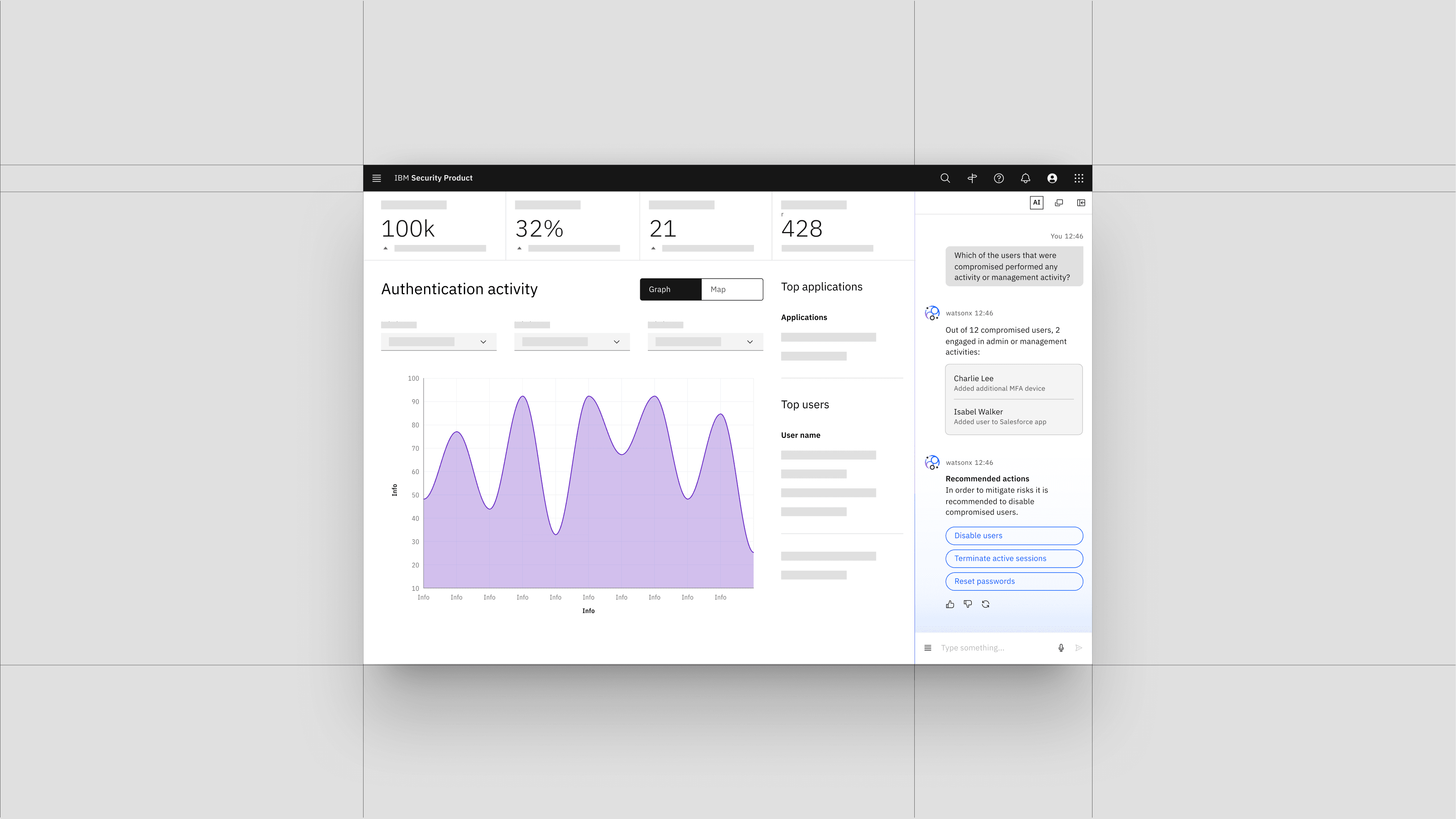
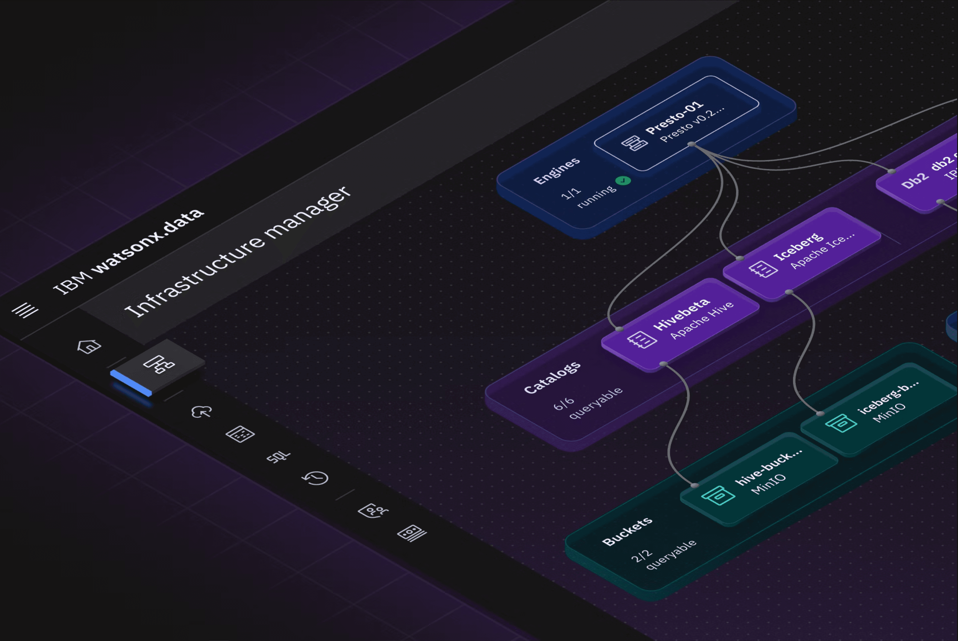
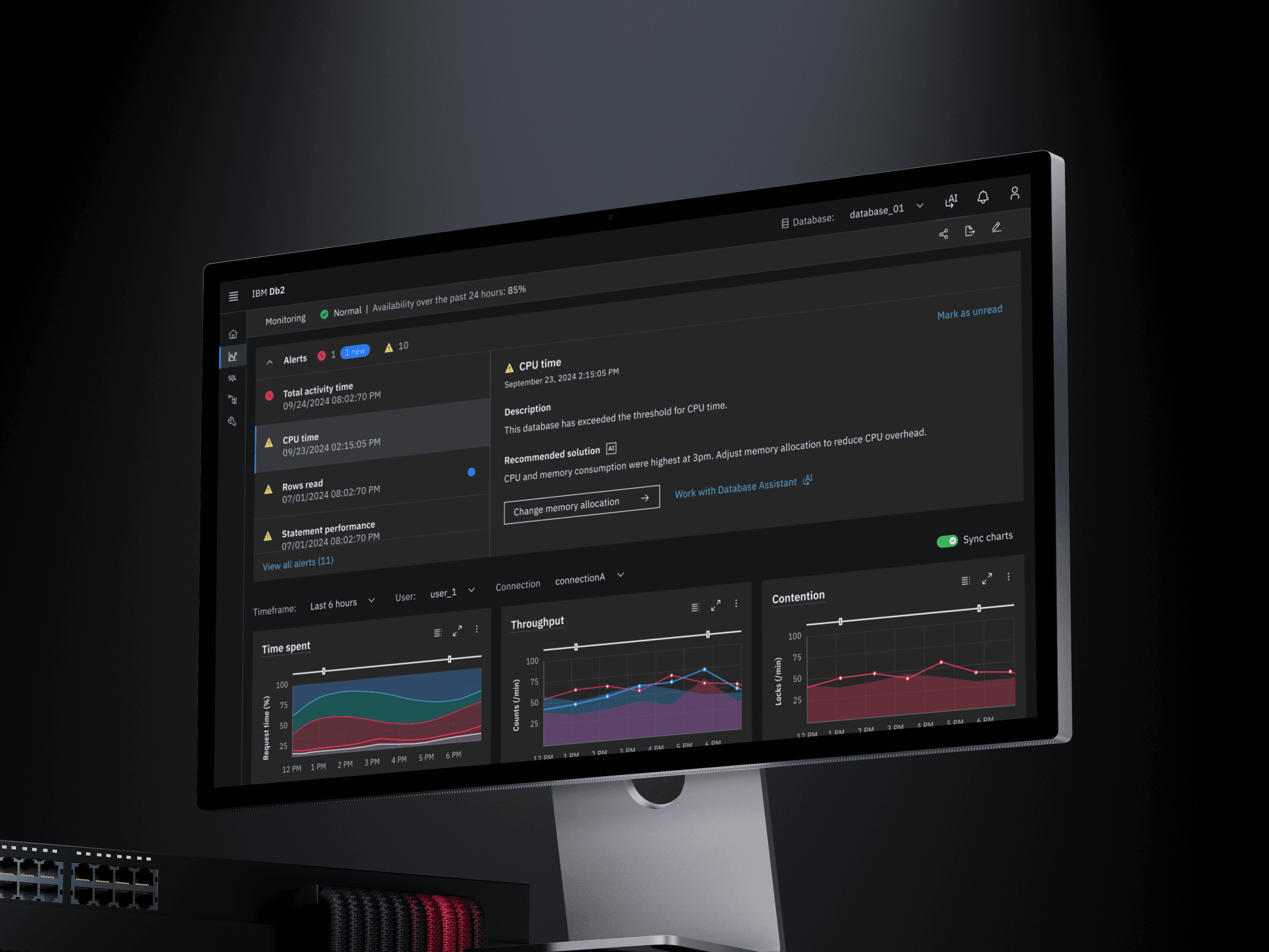
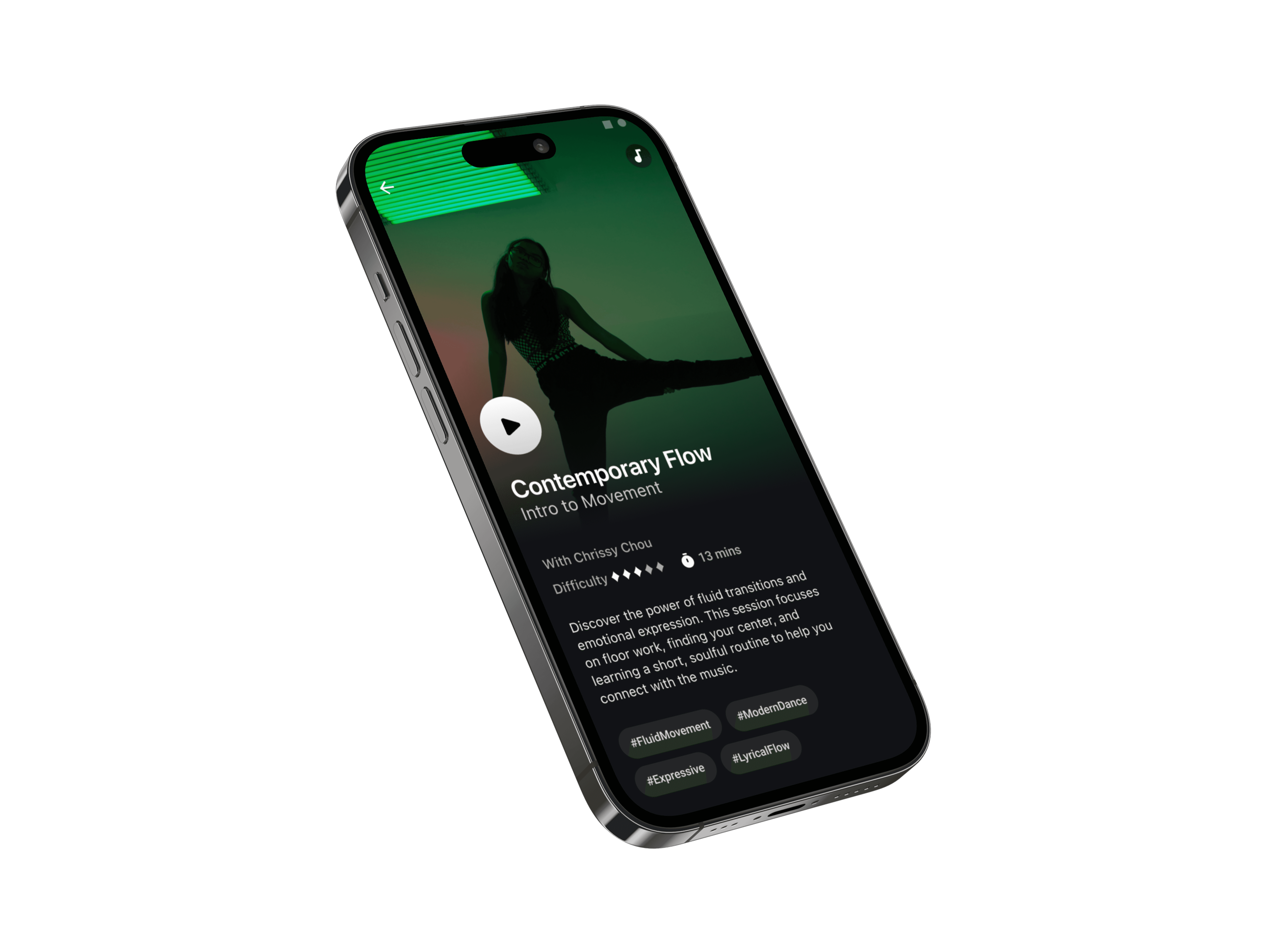
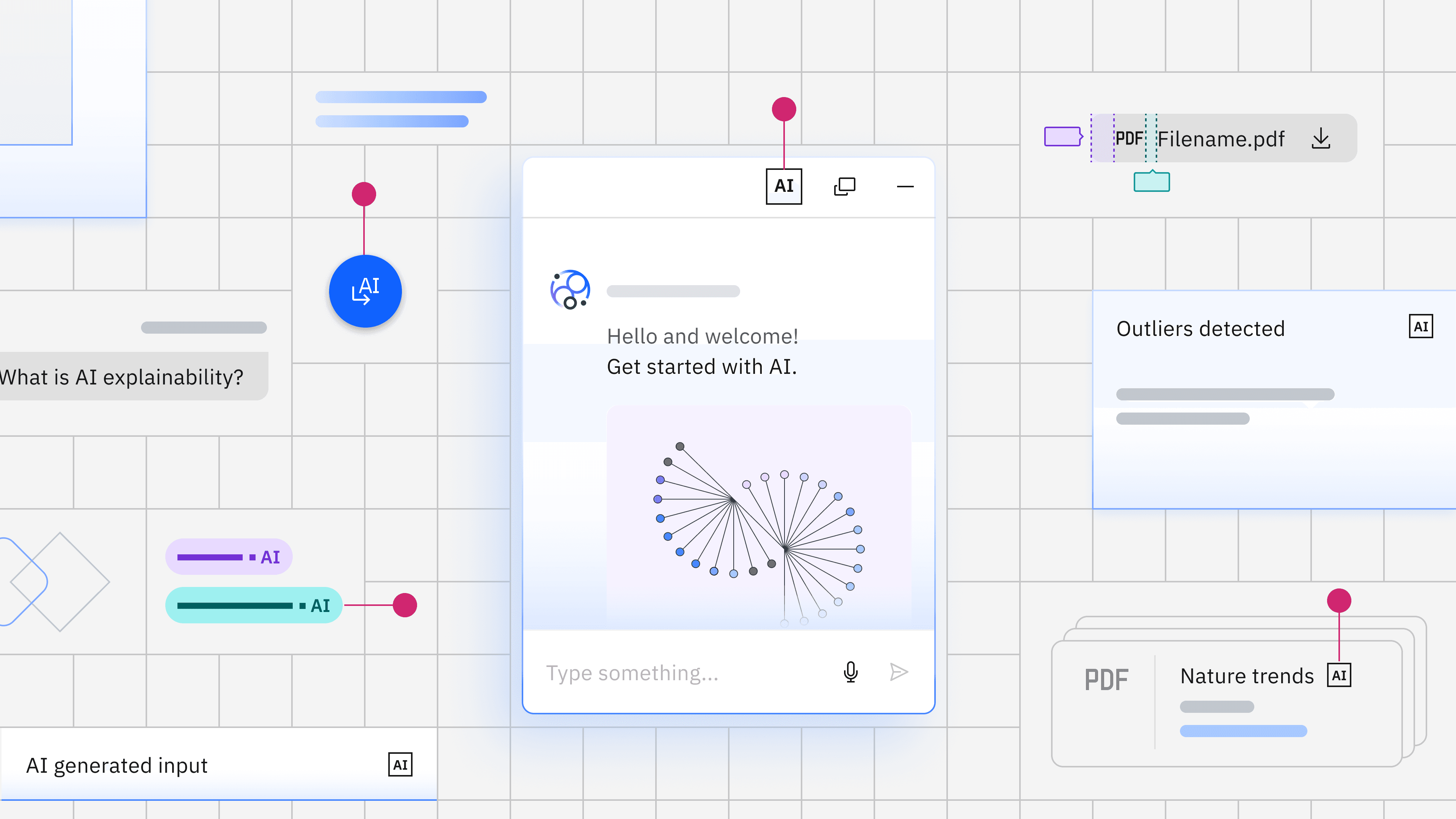
Carbon for AI explored how recurring generative AI behaviors could be made understandable across real product workflows and then translated into patterns that could scale across IBM’s AI portfolio. As AI began thinking, generating, editing, taking action, and asking for input, teams needed clearer ways to communicate what the system was doing, what would happen next, and when users needed to step in. I focused on translating those behaviors into visual and interaction cues people could read intuitively, shaping hierarchy, motion, spatial placement, contextual surfaces, and levels of disclosure so AI activity felt legible without becoming visually dominant. Working with the Carbon for AI team and product partners, we then turned those decisions into reusable patterns that could adapt across different products while preserving a consistent mental model of AI state, intent, and user control.
Team
IBM Carbon for AI team
Timeline
2024-2025
Role
Role
Lead Visual Design
Lead Visual Design

Understanding the problem
As generative AI spread across IBM products, teams were solving similar interaction problems independently. The challenge was not only consistency. Users needed to understand what the AI was doing, when its behavior required their attention, and when they needed more visibility into intent or reasoning before taking action.
Together with product designers, researchers, AI architects, and the Carbon for AI team, we identified the moments where those questions mattered most: active system states, actions with greater consequence or uncertainty, and moments where users needed to verify or regain control. These became the foundation for the patterns we explored next.
Understanding the problem
As generative AI spread across IBM products, teams were solving similar interaction problems independently. The challenge was not only consistency. Users needed to understand what the AI was doing, when its behavior required their attention, and when they needed more visibility into intent or reasoning before taking action.
Together with product designers, researchers, AI architects, and the Carbon for AI team, we identified the moments where those questions mattered most: active system states, actions with greater consequence or uncertainty, and moments where users needed to verify or regain control. These became the foundation for the patterns we explored next.
Making AI state legible
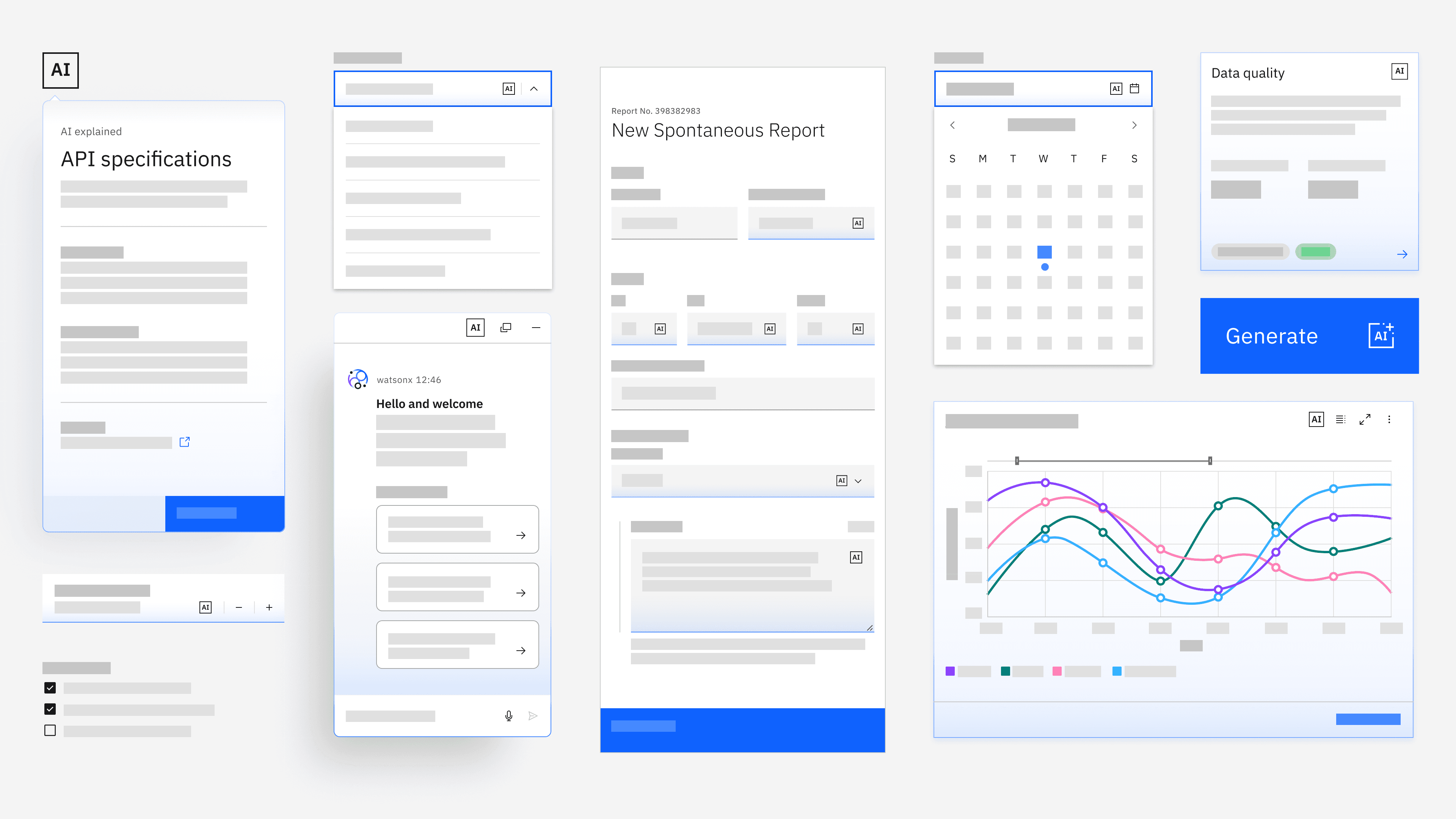
I explored how AI could become visible when it was actively supporting the user without turning the workspace into a persistent AI interface. Rather than giving every state the same treatment, I used placement, visual weight, motion, and persistence to communicate whether the system was available, working, waiting for input, or finished.
The interaction needed to feel responsive but calm. During processing and generation, subtle visual changes helped maintain continuity and reassure users that the system was active. When the work was complete or the user returned to direct editing, the AI controls receded so the content became primary again.
// Image caption: I wanted AI to feel present without feeling needy. If every state glows, moves, or expands, users stop knowing what deserves attention. So I treated visual presence almost like a volume control.
image 1: Code selected and explain and edit pop up gentaly
imagw 2: subtle hint show up for explain
image 3: generating?
Making AI state legible
I explored how AI could become visible when it was actively supporting the user without turning the workspace into a persistent AI interface. Rather than giving every state the same treatment, I used placement, visual weight, motion, and persistence to communicate whether the system was available, working, waiting for input, or finished.
The interaction needed to feel responsive but calm. During processing and generation, subtle visual changes helped maintain continuity and reassure users that the system was active. When the work was complete or the user returned to direct editing, the AI controls receded so the content became primary again.
// Image caption: I wanted AI to feel present without feeling needy. If every state glows, moves, or expands, users stop knowing what deserves attention. So I treated visual presence almost like a volume control.
image 1: Code selected and explain and edit pop up gentaly
imagw 2: subtle hint show up for explain
image 3: generating?
Matching the surface to consequence
Not every AI action deserved the same amount of interface. We looked at scope, uncertainty, reversibility, and consequence to determine when AI could remain lightweight and when users needed stronger opportunities to inspect or intervene.
I translated those differences into visual hierarchy and surface behavior. A low-risk suggestion could stay quiet and close to the content, preserving momentum. A generated result that required inspection needed more room and clearer controls. As actions became broader or harder to reverse, the interface became more explicit, giving users more space to understand what the system intended to do before continuing.
// Image caption: One thing we realized was that visual weight itself communicates consequence. If I put every AI action into a large panel, everything feels equally important. So I used space, hierarchy, and persistence to signal how much attention a decision actually deserved
Matching the surface to consequence
Not every AI action deserved the same amount of interface. We looked at scope, uncertainty, reversibility, and consequence to determine when AI could remain lightweight and when users needed stronger opportunities to inspect or intervene.
I translated those differences into visual hierarchy and surface behavior. A low-risk suggestion could stay quiet and close to the content, preserving momentum. A generated result that required inspection needed more room and clearer controls. As actions became broader or harder to reverse, the interface became more explicit, giving users more space to understand what the system intended to do before continuing.
// Image caption: One thing we realized was that visual weight itself communicates consequence. If I put every AI action into a large panel, everything feels equally important. So I used space, hierarchy, and persistence to signal how much attention a decision actually deserved
Designing trust across time
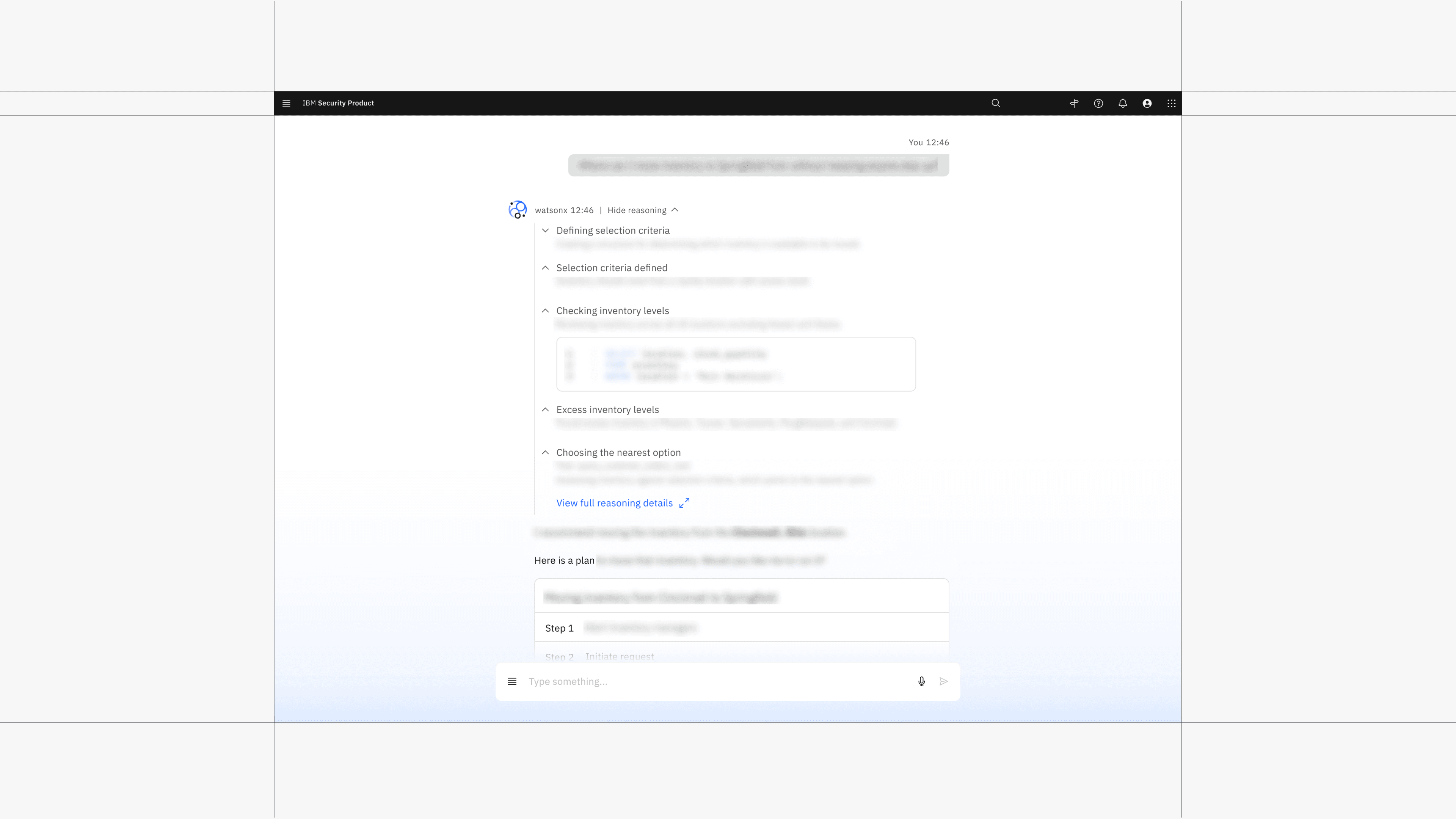
Transparency meant different things at different moments. Before a broader action, users needed to understand what the system intended to do. While the system was working, they needed enough feedback to know that progress was continuing. After an output was produced, reasoning and supporting evidence helped users decide whether it was reliable enough to act on.
We explored those needs as different layers of disclosure rather than exposing every system detail at once. Plans made intent inspectable before execution, active states maintained awareness during the task, and deeper reasoning or provenance became available when users needed to verify the result.
Designing trust across time
Transparency meant different things at different moments. Before a broader action, users needed to understand what the system intended to do. While the system was working, they needed enough feedback to know that progress was continuing. After an output was produced, reasoning and supporting evidence helped users decide whether it was reliable enough to act on.
We explored those needs as different layers of disclosure rather than exposing every system detail at once. Plans made intent inspectable before execution, active states maintained awareness during the task, and deeper reasoning or provenance became available when users needed to verify the result.
Testing the system where it breaks
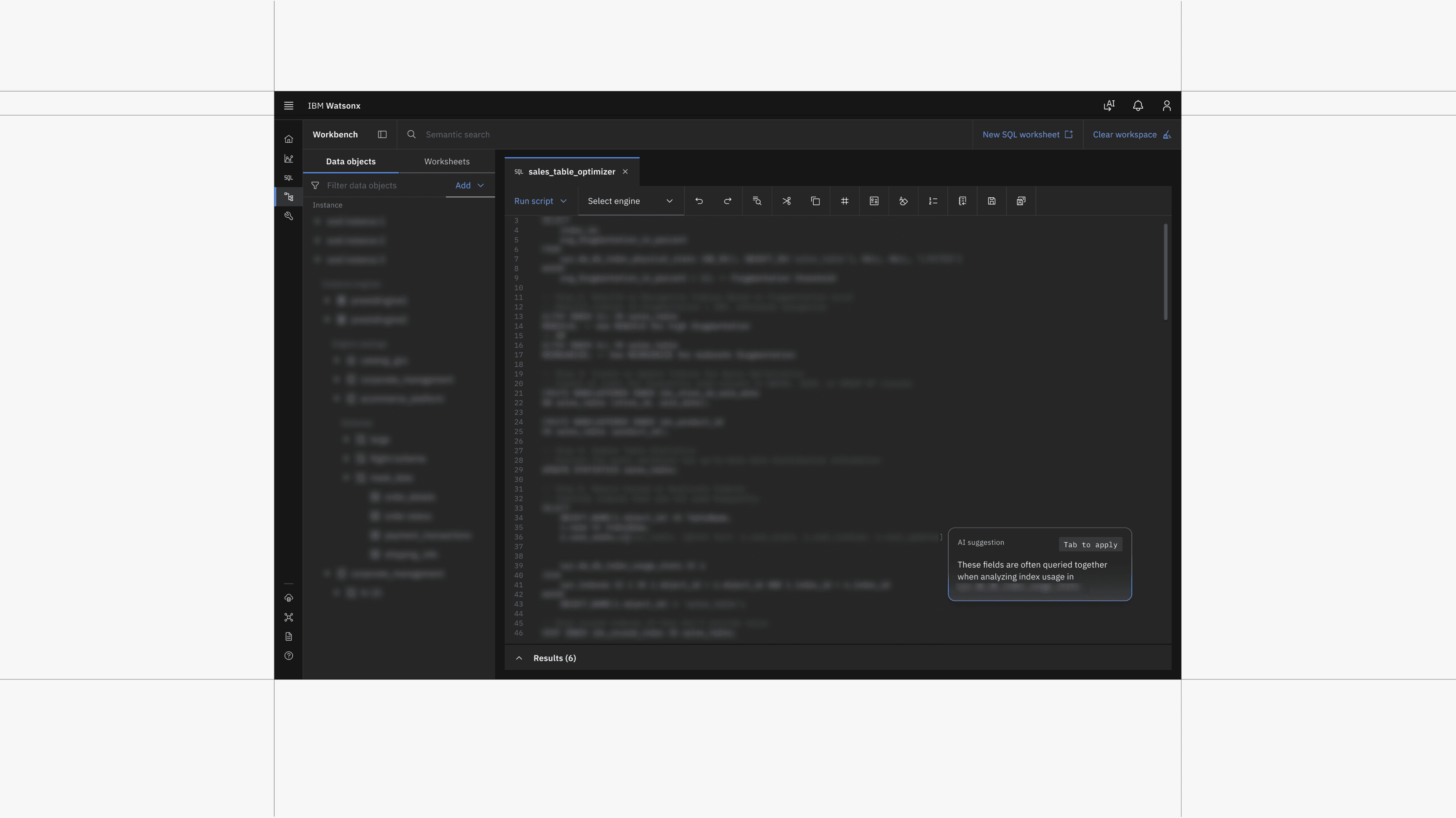
We tested patterns across different products and workflows rather than assuming one treatment would work everywhere. Through Carbon for AI reviews, office hours, and collaboration with product designers, researchers, AI architects, and developers, we looked at where uncertainty, engineering constraints, model capability, reversibility, and user consequence changed the interaction.
I used those product contexts to refine how the visual states behaved in practice, while we worked as a team to determine which principles were reusable enough to become Carbon guidance and which needed to remain flexible by product.
The goal was not to force every AI experience into the same interface. It was to establish a shared behavioral language that could still adapt to what the system was doing and what the user needed to understand.
We stress-tested the patterns across different content types, interaction states, themes, and accessibility constraints to understand where the visual system held up and where it needed to adapt. That included checking how AI treatments behaved in code, errors, read-only states, and light and dark themes, as well as refining color mappings where existing tokens no longer provided enough contrast.
Testing the system where it breaks
We tested patterns across different products and workflows rather than assuming one treatment would work everywhere. Through Carbon for AI reviews, office hours, and collaboration with product designers, researchers, AI architects, and developers, we looked at where uncertainty, engineering constraints, model capability, reversibility, and user consequence changed the interaction.
I used those product contexts to refine how the visual states behaved in practice, while we worked as a team to determine which principles were reusable enough to become Carbon guidance and which needed to remain flexible by product.
The goal was not to force every AI experience into the same interface. It was to establish a shared behavioral language that could still adapt to what the system was doing and what the user needed to understand.
We stress-tested the patterns across different content types, interaction states, themes, and accessibility constraints to understand where the visual system held up and where it needed to adapt. That included checking how AI treatments behaved in code, errors, read-only states, and light and dark themes, as well as refining color mappings where existing tokens no longer provided enough contrast.

Outcome
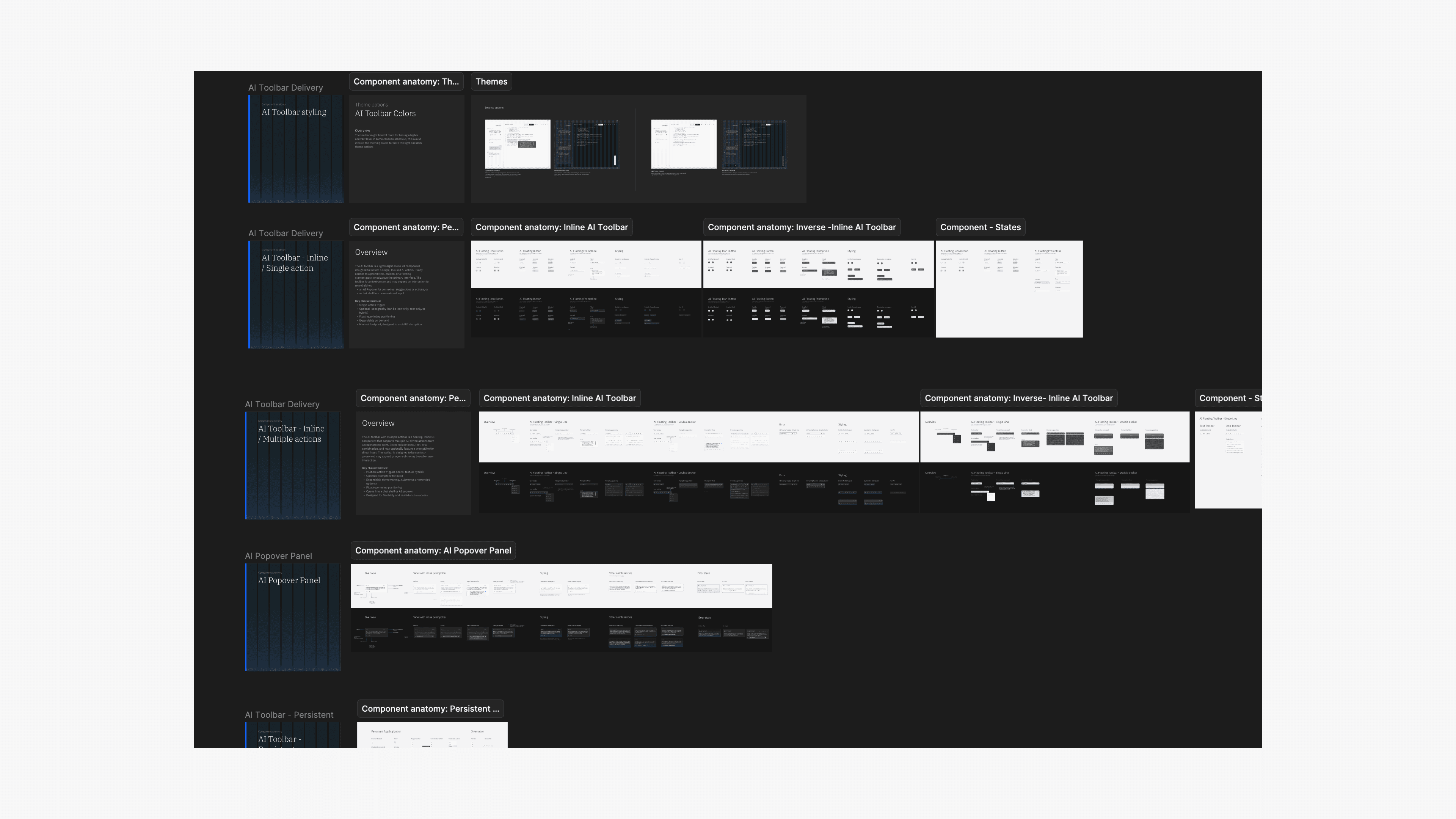
The work gave teams a shared interaction vocabulary for recurring AI behaviors instead of requiring every product to independently solve progress, reasoning, automation, contextual AI, and user control. The patterns were adopted across 15+ product teams, implemented through reusable Carbon structures, and shipped across IBM’s AI portfolio.
The broader Carbon for AI work was recognized by Red Dot, iF Design Award, and Core77, while the shared patterns helped teams build new AI experiences from an established behavioral foundation rather than starting from scratch.
Outcome
The work gave teams a shared interaction vocabulary for recurring AI behaviors instead of requiring every product to independently solve progress, reasoning, automation, contextual AI, and user control. The patterns were adopted across 15+ product teams, implemented through reusable Carbon structures, and shipped across IBM’s AI portfolio.
The broader Carbon for AI work was recognized by Red Dot, iF Design Award, and Core77, while the shared patterns helped teams build new AI experiences from an established behavioral foundation rather than starting from scratch.
Outcome
The work gave teams a shared interaction vocabulary for recurring AI behaviors instead of requiring every product to independently solve progress, reasoning, automation, contextual AI, and user control. The patterns were adopted across 15+ product teams, implemented through reusable Carbon structures, and shipped across IBM’s AI portfolio.
The broader Carbon for AI work was recognized by Red Dot, iF Design Award, and Core77, while the shared patterns helped teams build new AI experiences from an established behavioral foundation rather than starting from scratch.
Other Cases
Other Cases